 I'm thinking about this because I have anew Molly Murphy book coming out next Tuesday and I had to request some cover changes. The first cover had Molly wearing a cloche hat and a low slung belt, looking very Twenties instead of 1905. When I brought this to my editor's attention the artist said that he had a picture of that very hat in Paris 1905. So they were always ahead of the times in Paris, but it still looked 1920.
So the hat was changed, the belt was removed and Rhys was a happy camper. But it reminded me how important it is that the cover gets the flavor, the time, and the type of book just right. The reader is seriously miffed if the cover promises one type of book and she gets another. This happened to me once, many years ago when I wrote historical romances. At least I didn't think the first one as a historical romance. I thought it was a historical novel (with a touch of romance). But it came out with a cover with the blouse hanging off one shoulder, red hair cascading down her back and Fabio standing behind her. Doomed. No man would ever read it and the women readers would be disappointed because the romance wasn't the driving story.
I've just spoken at the San Francisco Writer's conference and Mark Coker of Smashwords spoke on the importance of cover when selling an e-book. The words have to be big enough to read in thumbnail. You can't make it too light or it blends into the white page and it has to shout out what kind of book it is. Not easy for something that appears about an inch big on Amazon.
But his rules are true for all of us. Name and title big enough to read across the room, appealing colors and must shout out what kind of book it is.
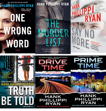
 I ran a poll recently on my Facebook page (www.facebook.com/rhysbowenauthor) about the importance of cover and quite a few people said "That's how I found your books." Almost everyone agreed that the cover first drew them, then they read the blurb on the back and maybe the first page or so. I think Hank's The Other Woman illustrates just perfectly all the points made above: great design. Says exactly what kind of book it is. Words big enough to read.
 While Lucy's promises the kind of cozy fun we're going to get.
My Constable Evans books had covers much cozier than the books. Every one had some kind of farm animal on it and I once announced that I had won the Old Macdonald award. Everyone clapped until I said "for the most farm animals on covers." But I think in my case the cover put off some serious mystery readers.
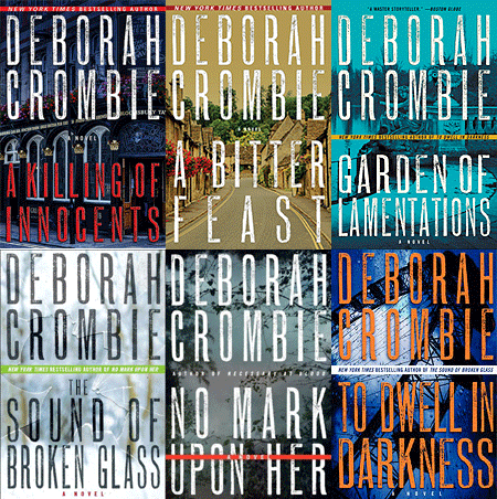
And now the trend for big names is to have just name and title huge on cover and not much else. Look at Deb's upcoming book
Or Louise Penny's.
So what do you like? Do you want a picture on the cover, showing you what sort of book it is? Does the cover draw you to buy a book? Have you ever been misled by a cover and disappointed that the book did not live up to the image?


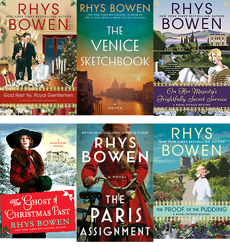
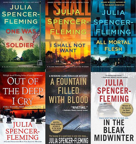
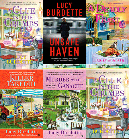
While I always enjoy the cover art, it generally is not what initially draws me to the book. It's the author's name that compels me to pick up the book and read the blurb on the back and peek inside . . . .
ReplyDeleteYes, the cover is important for catching the eye. I certainly like some type of picture on there and not just words. However, ultimately, it is the description of the story that will decide if I buy it or not for an unknown author. If it's an author I know, I'll probably buy it without even reading the back and the cover won't matter.
ReplyDeleteI swear I have the funniest conversations with my editor and agent about covers. (And by the way, I LOVE the Key West covers.) This week we had a flurry of emails about the expression on the cat's face:).
ReplyDeleteAll that to say, covers are taken very seriously. If you already know an author, it might not matter so much. But if not, the right cover can draw a reader to choose the book out of a stack on a table or bookshelf. After that, it's up to the words to seal the deal!
Cover art gets your attention, but titles matter more to me. I never read the blurbs, but do check to see how many pages the book has. I also never read the first page. If it's an author I've liked I buy the book. I do read reviews on amazon.
ReplyDeleteCovers say so much. The cover of my first local foods mystery was gorgeous - a big basket of vegetables - but it didn't look like a cozy! No cat, no barn, no bloody pitchfork, despite my suggestions (at their request) for including exactly those. It looked like a cookbook or a gardening book. They've fixed that for book two and for the paperback of book one.
ReplyDeleteLucy/Roberta — LOVE the expression on the cat's face!
ReplyDeleteOh, this issue is so near and dear to me.
ReplyDeleteI hated (and still do) the cover of my debut novel. I wept. I fought with my agent and editor. But the marketing people won. Until it was time for the paperback, when everyone conceded that I had been right, and I was given a beautiful cover (although still one that I don't feel captures the mood story)
I learned many lessons from this - about marketing, about big publishers, about being gracious, and so on. And I hope that the next time around, things will be different!
As for the covers I like, I want an image that captures the mood of the book. It's interesting, because looking at the Jungle Red covers you've posted, I feel that all of these covers do just that - even the ones using simply names and titles.
It's a weird world - the cover art world, these days. But as unhappy as I was with mine, I'm still grateful to be a part of it!
I am such a fan of cover art.
ReplyDeleteThe first thing I buy a book for is the author.
But if I'm in a bookstore and just browsing around hoping to find something new, a smashing cover can draw me in like bees to honey. But it won't be reason enough for me to buy the book until I've read the cover info, the blurbs and the first couple pages. Some of my favorite covers are Kerry Greenwood's Phryne Fisher covers, which I think are delightful little works of fashion art.
A good cover telegraphs the kind of story you'll find inside and a feeling for the author's brand.
ReplyDeleteI love Gillian Flynn's covers. Her Sharp Objects was all black with an embossed silver razor blade.
For me the cover is very important. Even though we read most books on e-readers in this day and age, the cover gives me an idea of the flavor of the book.
ReplyDeleteI'm about to work with my publisher on my debut mystery/suspense. Your post helped me see how important it is to stay involved and to push for just the right image.
Thank you Rhys! Theres always that moment for writers… When the email arrives with the subject line "your cover!" and you know in the next second , the moment you click--your life will change .
ReplyDeleteHank, so true...
ReplyDeleteRhys, to be honest, I'm not crazy about the new cover look for my books, although I loved The Sound of Broken Glass. And I think To Dwell in Darkness will really pop off the shelves. Personally, I'm much more draw to covers like those on your Molly books. But I know the publisher wants to place my books a certain way, and I can't complain because it seems to work.
The cover of a book seems to me to indicate genre and sub-genre almost completely by what colors are used, and how "serious" the cover is. When I browse a book table, I can eliminate many books without even reading the title.
ReplyDeleteEven within the sub-genre of cozies, for example, I can figure out how much depth the book will have by how the art is done.
And I am sorry to say, I would not pick up the cover Rhys described with Fabio!
Rhys, your cover of CITY OF DARKNESS AND LIGHT is beautiful. I look at that cover art and want my hands on that book. I'll take that and any others you have on hand!
ReplyDeleteI felt the same way when I saw Hank's cover for THE OTHER WOMAN. Woah... mysterious woman crossing MY footbridge in Boston! Must have it!
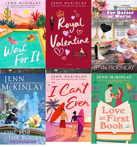
Lucy's Key West covers say fun and good food are waiting for you here. I cannot resist a cover like MURDER WITH GANACHE. Give it here, please! And I'll have one of those cupcakes on the cover and the kitty too—the one on the right—please. If you give me the one on the left I'll need those drinks and all the cupcakes. I'll take two!
Louise Penny's covers always tell me here is a deep undercurrent, and I love deep undercurrents. Sold! And what comes after HOW THE LIGHT GETS IN? I need it. Now!
Now with Deb's name I can't miss. It's Deb's! I will love it. What was the name of it, again? TO DWELL IN DARKNESS? Deb wrote it. Who cares what she called it? Hand it over!
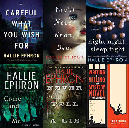
Hallie's COME AND FIND ME... perfect cover with woman standing in the shadowy woods, with head down. What else do I need to make me want it? Give!
Julia's ONE WAS A SOLDIER with the flag at half-mast. What could be more poignant and telling? I'll take it! Any more copies?
Susan's MR. CHURCHILL'S SECRETARY with the war planes flying overhead... No way could I pass up that book! Please wrap it up and tell me it's a series... I need more!
Yes! Covers matter!
Generally speaking, I don't pay much attention to a book's cover unless it's just so eye catching and would never buy a book just because I liked the cover. However, I would probably not even pick up a book with a cheesy cover such as Rhys described.That being said, I love the cover of your new book, Rhys and it definitely falls into the eye catching category!
ReplyDeleteI love the cover or Rhys new book
ReplyDeleteFor an author I have never read, covers do catch my attention and I'l pick up book to look at if cover looks intriguing to me, if cover is really "creepy" I probably will not pick up the book as I don't like Thrillers - a bit to graphic in most cases for me
For authors I have read, cover doesn't matter, I"m going to pick up the book anyhow
I love the cover on Debs latest book "The Sound Of Broken Glass"
I thought it was soo neat that the cover was textured, making it feel like it could be broken glass - that was really neat.
For authors I do read, a cover that grabs my attention is a bonus
Congrats to all the authors with new books out !!!!
For some reason, covers aren't that important to me. Especially for authors I already now and read.
ReplyDeleteHowever...
I love the art work on Rhys' Georgie books. I always look for the tall, dark, and handsome man and Georgie who always look elegant.
The art work on Susan's books is impressive.
HOW THE LIGHT GETS IN is a brilliant cover.
The cover of Deb Harkness' next book is wonderful
I listen to a lot of audiobooks and I love that the cover is displayed on my phone as I listen.
I love going around a bookshop looking what there is on offer and then a cover is really important because it signals to me: hey, take me you'll find me interesting! It's not important for books by authors I already know.
ReplyDeleteRhys, I loved the covers for your Constable Evans books. I imagine Constable Evans seeing the farm animals while hiking from the police station to the mountains.
ReplyDeleteAll of the book covers in this article looks great to me.
Though I wondered about something. I wonder about your readers who may be color blind.
If one of the authors or readers was color blind, was there any problem with the book cover?