DEBORAH CROMBIE: We have so much fun on Jungle Red--there's always something new and entertaining. Today we have a first ever (I think) for us--an official COVER REVEAL from one of our favorite authors, Mark Pryor. Mark is giving JUNGLE RED the first look anywhere at the cover of his upcoming Hugo Marston novel, THE BOOK ARTIST! I am a huge fan of this series so cannot wait to get my hands on this absolutely gorgeous book! Without further ado, here's Mark to tell us about it!
MARK PRYOR: There are
many exciting moments in an author's life, and with a book release on
the horizon there's much to look forward to. Top of the list is release
day itself, and close behind is getting that big box of books from the
publisher.
On
a par with that, in my opinion, but months earlier, we first see the
cover art for the next book. It's a little bit like Christmas except,
with my publisher at least, I get to choose which present I want! (While
my publisher has final say-so on which cover we use, they always consult me, and sometimes even listen!)
Oh,
before I get ahead of myself, and since this is the topic of this post,
please allow me the honor of sharing the cover for my upcoming mystery
novel with you, the next in the Hugo Marston series, and say a big thank
you to my friends at JRW for letting me do this exclusive reveal on
their wonderful blog!
Here it is:
The
fantastic artist at Seventh Street Books actually sent me three
options, but this one was my immediate favorite. For one thing, all that
color just makes it pop off the page. And I think the pinks and yellows
tie in well with the title, and the subject matter of an artist.
The
eternal question, of course, is how much difference does a good cover
make? We all know the adage about how we shouldn't judge a book by one.
But the reality is, we do. I know I do, absolutely. And I think it's OK,
because a good cover can tell you something about what's beneath it, on
the page. It can convey mood, and tone, tell you who one or more of the
characters might be. But the most important role of a good cover, of
course, is to make the browsing shopper pick it up from the shelf, or
click on it while perusing online books. After that, it's up to the
author to snag the reader's attention...
Now,
I know many readers of this blog enjoy mystery series, like Debs's
Duncan Kincaid / Gemma James novels, and those present publishers with
their own challenges. Most notably: how do you keep the covers of a
series consistent, but also fresh?
Take my first three books, all of which were basically black and white.
I loved them all but, as the number of books in the series grew, it
became increasingly obvious to me and the good people at Seventh Street
that we couldn't stick to black and white forever. So, while staying
with the "obviously Paris" theme, we moved into richer colors with THE
PARIS LIBRARIAN and THE SORBONNE AFFAIR.
One
of the mock-ups for the January release of THE BOOK ARTIST was quite
similar to these but, once again, SSB and I went for something slightly
different, the more colorful (dare I say braver?!) option. And as I
said, I love it.
So I'm curious, JRW writers, how important are covers to you, and how much input do you try and give.
Likewise
for JRW readers, how much attention do you pay to book covers? Are
covers more important for stand-alone books than for series books (that
you'd likely buy anyway)?
About THE BOOK ARTIST:
Hugo Marston attends the opening night of an art exhibition in Montmartre,
Paris, and is less than happy about going until he finds out that the
sculptures on display are made from his favorite
medium: books. But soon after the champagne starts to flow and the canapes
are served, the night takes a deadly turn when one of the attendees is
found murdered.
Hugo
lingers at the scene and offers his profiling expertise to help solve
the crime, but the detective in charge quickly jumps to his own
conclusions. He makes an arrest, but it's someone close to Hugo, and someone he's positive
is innocent. Meanwhile, his best friend Tom Green has disappeared to
Amsterdam, hunting an enemy from their past, an enemy who gets the upper
hand on Tom, and who then sets his sights on Hugo.
NOW AVAILABLE FOR PRE-ORDER:
BookPeople (where you can request a signed copy)
READERS, Mark will be stopping in to chat today and I'm sure we have a lot to say about covers.
And here's more about Mark--
He is the author of the Hugo Marston mystery series, set in Paris, London, and Barcelona.
The most recent is THE SORBONNE
AFFAIR, a "flawlessly constructed whodunit," according to Booklist.
His previous novel in the series was THE PARIS LIBRARIAN, which the Toronto
Globe & Mail says “has it all… a finely structured plot that’s one of
Pryor’s best books yet.” The first Hugo Marston novel, THE BOOKSELLER, was
a Library Journal Debut of the Month, and called "unputdownable" by
Oprah.com, and the series has been featured in the New York Times.
Mark is also the author of the
psychological thriller, HOLLOW MAN, and its sequel, DOMINIC, published in
January of 2018. He also created the nationally-recognized true-crime blog
'D.A. Confidential.' As a prosecutor, he has appeared on CBS News's 48 Hours
and Discovery Channel's Discovery ID: Cold Blood.


That new cover looks amazing!
ReplyDeleteThank you so much!!
DeleteMark P.
This comment has been removed by the author.
ReplyDeleteMark, I really enjoy your Hugo Marston series and I’ve enjoyed seeing the evolution of your book covers as each new book was published, but I must say this newest cover is absolutely stunning. I’m already anxious to read the story!
ReplyDeleteWhen I’m browsing through the shelves in the bookstore, I tend to notice covers like this one, the ones that stand out, whether they’re for a series like yours or for a stand-alone book. In either case, I’d pick that book for a closer look and would be more likely to purchase it . . . .
Joan, I love to hear that! I hope you like the new one, when it pops out on Jan 8. Thanks for commenting!
DeleteMark P.
Unless I'm pre-ordering the next book in a series as soon as it's announced, covers are the first thing that snags my attention. Some covers tell me the book is lighthearted, or darkly serious. Others just make me want to pick it up for a closer look. And some make me want to frown sternly at the cover artist. For instance, what's with all the headless female torsos on romance covers? Don't we primarily read romances for the characters? I know I do. Guys might appreciate headless female torsos--they have all the relevant lady parts, after all--but I think women want to see that the main character has a brain as well as boobs. With mysteries I mostly just want to know whether or not the book is going to be some kind of grim, dystopic bloodfest with deviant elements. I avoid those at all cost.
ReplyDeleteYour cover is lovely. It reminds me of some Crombie covers. I like the gradual creeping in of more and more color as the series progresses.
Agree on the headless torsos, Gigi, and this is one fella who doesn't gor for them.
DeleteAppreciate the comparison to Debs's book covers... now I just have to work on making my stories as good as hers!!
Best,
Mark P.
Your new cover is gorgeous! As for your question, a good cover may get me to look into a book by a new author, but if it's an author I'm already familiar with it won't influence my decision to buy.
ReplyDeleteThat's kinda what I thought, Marla, makes perfect sense.
DeleteThanks!
Mark P.
Welcome Mark, that cover is stunning! and you are right, seeing the cover for the first time is one of the most exciting moments in the writing life.
ReplyDeleteThanks, Lucy, and glad you agree!!
DeleteMark P.
I love this new cover and I think it flows perfectly from the other covers in the series. As Deb says, these have always been striking covers. Seventh Street Books really does care about cover designs - and it shows.
ReplyDeleteKris, I agree SSB puts a lot of thought into covers, and it shows. Looking fwd to seeing you at B'con!
DeleteMark
Mark, your cover is stunning! I have not read any of the Hugo Marston books, but I am motivated to start. (Not just by the excellent cover, but also by the strong recommendations of so many Reds friends!)
ReplyDeleteI've been thinking a lot about book covers lately because I have started downloading audio books from the library. While I will search for a favorite author or wait on a list for a specific book, very often I need a book and I need one NOW, so I search for mysteries, available now. That brings up a pretty overwhelming number of pages of books, so I start off scrolling through quickly just glancing at the title, author, and book cover. When I don't know the author, I really rely on that book cover to communicate to me what type of mystery it is.
In that vein, I have been thinking lately that if I were a published writer of cozy mysteries, I don't think I'd be very happy with the current trends. I feel like I see far too many interchangeable covers. They communicate to me that it is a cozy, but not that it's any different from a million other cozies.
Thrillers seem to have a set of conventions for their covers, too. Not in the problematic, too-much-sameness way I see it in cozies, but usually I can glance at a cover and realize the book will be a thriller. So as I scroll, it is easy to identify cozies and thrillers. But the rest....that's where I feel like I see really creative covers, things that make me stop to figure out if it might be a book that would appeal to me.
Susan, I so agree on the cozy covers--many of them do seem to be interchangeable. Swap the cat for a dog, the bookstore for a bakery, and new story!
DeleteAnd why does there often seem to be a basket of apples on the cozy cover? I agree. They are often too similar.
DeleteThanks, Susan, if you do launch into the series, I hope your expectations are met. :)
DeleteI don't really fault the cozy cover-designers, it must be such a hard job to convey cozi-ness AND originality, and I'm sure the former is their biggest concern. A tough job, and one I'm glad I don't have to do!
Mark P.
Beautiful cover, Mark! I'm not at all familiar with your series but that image certainly makes me want to pick up the book!
ReplyDeleteThanks Judi... I dare you...! ;)
DeleteMark P.
Judi, they are terrific!
DeleteI've enjoyed your series and I like your concept (intentional or not) of adding more color to your book covers as the series progresses.
ReplyDeleteThank you, Margaret, lovely to hear that! And yes, that's exactly right, it's like the characters are getting filled in too, as we go along with the series. So there you have it, unintended symbolism!
DeleteMark P.
mark, congratulations on the new book. The cover art is exceptional. To your question, I have recently changed how I look at book covers. #1. I am a visual thinker. #2 I was, until recently, a brick and mortar bookstore shopper. When I would find a series I liked and I began to collect them, I looked for continuity in the cover art. I enjoyed the "growth" in the art as much as I did the character art. Then I received a Kindle for Christmas. I quickly became a hybrid shopper. Who can say no to a deal-of-the-day $1.99 price tag? And instant gratification, start reading in minutes? Wow! The kindle also marked the beginning of the shift in the level of attention I gave to cover art. It's difficult to enjoy all the thought and detail and creativity of a cover when it's reduced to the eye-straining size of the on-line thumb nail icon. Fortunately I continue to shop brick and mortar, which is where I will pick up a copy of your latest!
ReplyDeleteThat's a great point about the thumb-nail size. I'm sure cover designers have to take that into consideration, and it seems like it'd be a recipe for less detail, wouldn't you think? Bolder images and... more color?! I don't know, like I said it must be a tough balance.
DeleteIf you get your hands on a copy, I hope you like it!
Mark P.
Mark, I've liked all your covers and I have to say this one is exquisite!
ReplyDeleteI think book covers are moderately important. They need to grab the eye and send a good message about the story inside - set expectations, as it were. The best covers do that.
I was extremely fortunate that Level Best provided me with three options for ROOT OF ALL EVIL and I got to pick the one I wanted. It's gotten some gushing compliments, so I guess I picked the right one!
Mary/Liz
Now there's some pressure, Mary, but well done! I always trust the folks at SSB because in the end they're the experts on covers. I just write the book!
DeleteBest of luck with the new novel, I hope you sell a million copies!
Mark P.
Thanks, Mark!
DeleteMary/Liz
SO gorgeous. Wow. I think there really is something to the jewel-like oh-I-have-to-touch-that cover, you know? And one that stands out in an array of books. It's natural for our eyes to gravitate to "pretty" or "different"--and for some reason, it seems like an enticing cover means someone cares about the book inside. They loved and respected it enough to be proud of it. ANd thank you so much for letting us show YOU off!
ReplyDeleteThank you so much, Hank! It's an honor to come here and share with you all, and your readers. And best of luck with YOU new one, I know it just hit the shelves. Go get 'em!
DeleteMark
And oh, seeing your cover for the first time? The email pops up, with the editor's subject line "Your cover!" With the exclamation mark so you know to be enthusiastic, right? And there you have it--your future, one click away. Will you love it? Or will the negotiations begin? :-)
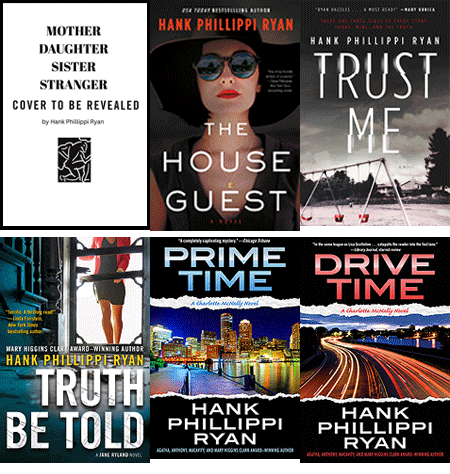
ReplyDeleteWhen I saw the cover of TRUST ME, I gasped--no exaggeration--at how amazingly clever it is. And I've seen readers gasp, too, when they see the hidden message. SO--yeah. When they work, they really work.
And I totally agree, the cover for TRUST ME works (understatement)!
DeleteBeautiful cover, Mark! It would definitely make me pick it up.
ReplyDeleteCovers hold clues; that old saw, "You can't tell a book by its cover" is so much less accurate these days, as publishers provide more information about the content more often. As Gigi said, the tone of the book is an instant hint, which helps make buying decisions more quickly. Maybe it's subliminal, but with so many books available, every tiny bit of information that helps us choose is important.
Very true, Karen. I suppose these days with photoshop etc it's much easier to create variety, or something that matches the inside of the book, compared to the 'old days' when are was harder to manipulate.
DeleteMark P.
I was thinking of the really old days, when the only thing on the cover of a book was the title and the name of the author!
DeleteSo great to see that another addition to the Hugo Marston series is coming soon!
ReplyDeleteWhen browsing in a book store, a book with an interesting cover will definitely make me stop and pick it up and read the information on the jacket to see if it's something I might want to read. I think that generally, colors are more eye-catching than black and whites. Your new book cover would definitely pique my interest ... it's gorgeous!
Thank you Mary!! Not soon enough, if you ask me... ;)
DeleteAnd ten million points for spelling "pique" correctly! Gold star. :)
Mark P.
Mark, I'm excited to learn of your series and check out the Hugo Marston books! As for covers, I feel they are extremely important. Along with the title, the cover art announces the kind of feeling the reader can expect to have when reading the book.
ReplyDeleteAs a reader, I'll admit I am turned off or turned on by covers. Certain "types" of covers help me weed out the books that I won't like--and perhaps unknowingly I am missing out on books I would like, just because of that.
Conversely, a gorgeous cover has made me buy and read many a book that later turned out to not fulfill the promise of the cover--in my eyes at least.
I was surprised when the publisher sent me the proofs for the cover for The Reluctant Fortune-Teller, because the Norbert in my mind was not the guy on the cover. We did exchange ideas and some adjustments were made. Now I like the cover very much.
One fascinating thing is when books are translated, they will be given different covers that will hopefully appeal to the people buying them. I found the French translation cover delightful, and it is completely different. Oh, and the Large Print edition has a cover that is a bit different than the original, too, and I like it!
Mark & Reds: What has been your experience of covers of translations?
Keziah, yes, the foreign editions are so interesting. My books do really well in Germany, where the covers are all sort of windswept moors and crumbling castles. Go figure. It seems to work. But my favorite of all the foreign covers are the Czeck editions. They print the design on the hard cover, rather than a paper jacket, and through the whole series they've been a very bright, stylized, almost pulp design. So fun. I should post on FB sometime.
DeleteKeziah, if you get to check them out, I hope you like them!
DeleteI think it's harder when you have people on the covers, everyone has their own picture of a particular person... maybe that's why the headless torsos on romance novels?!
Alongside the US covers, my favorites have been the Portuguese covers, which are very dark and brooding. Love those.
Mark P.
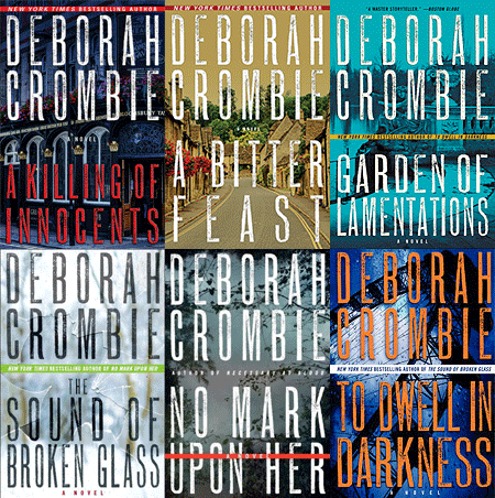
I really just want to walk into this cover--you can't get much more enticing than that. Mark, you've been so lucky to have an evolving cover style with the same publisher, and I'm assuming the same art director. I've been with three major publishers. The first two had no idea what they wanted to do with the covers and the art was all over the place. Not only no continuity, but also nothing that really told the reader what the books were about. One even had cacti! When I moved to William Morrow, they used my photos for the first five books, and I must say I really liked those covers. Then, with NO MARK UPON HER, they decided they wanted a redesign and a more abstract "bigger book" look--and that was the first book to hit the NYT list.Publishers' wisdom! With the latest, GARDEN OF LAMENTATIONS, they've kept the design but the background photo is a little less abstract. Very eye-catching, so I hope the trend continues.
ReplyDeleteMark, I know we can look it up, but do tell us when we can actually get our hands on THE BOOK ARTIST!!!
A cacti??????? Good grief!
DeleteI'm glad your experience has gone in the upward direction, better and better, that's good. I truly love the cover of GARDEN OF LAMENTATIONS and see what you mean about a 'big book.' And I guess so, since NMUH hit the NYT list!
I shoulda mentioned before, sorry, but THE BOOK ARTIST comes out January 8. :)
Good Morning, Reds! Good Morning, Mark! I am in love with the Hugo Marston series and cannot WAIT to read "The Book Artist." And this cover? Holy Cow - it's spectacular.
ReplyDeleteThank you Kaye, that's wonderful to hear! Not long now...!!
DeleteMark
Mark, I think all of those covers are stunning, and the continuity is terrific. Covers are a big deal, and I'm always amazed when the art department can come up with something that captures an image in my brain, as if they "saw" the same thing in the book that I did.
ReplyDeleteThank you Ingrid. For this one I love how the colors refelct the subject matter, color and art... it's so perfect!
DeleteMark P.
I love your new cover and want to go wherever it is!
ReplyDeleteThank you, Celia, I'll meet you there for coffee!
DeleteMark P.
Me, too!
DeleteHello again :-) . Welcome back to JRW, Mark Pryor. Your new book cover is gorgeous! I can see why that is your favorite! For me, I have favorite authors and I often recognize their books by their covers. The covers of their books are different from other books. There is a series and while I love the writing, the stories and the characters, I am not a big fan of the covers. However, when I see that particular art, I know that book is by that author.
ReplyDeleteI remember buying the first two Hugo Marston books as Christmas gifts for a relative. He loved your books. And I bought your book at Bouchercon last year.
Happy Friday,
Diana
Hi Diana,
DeleteThank you so much! I'm so glad you like it. :)
Will I see you at B'con this year? Hope so!
Mark P.
Hi Mark,
Deletewe are not going to B'con this year.
Will we see you at LCC 2019?
Diana
A wonderful cover, indeed. I notice you didn't name the artist, just said "The fantastic artist at Seventh Street Books". Is there a reason? I always like to see artists receive their due.
ReplyDeleteThey actually have a few, and I think it's a pretty collaborative process. But the main one for my books is Nicole Lecht, and I'm always sure to thank her in the acknowledgments!
DeleteMark P.
The covers are all very atmospheric, whether black and white or color. They're a great lead-in to what's inside.
ReplyDeleteHi Pat, I'm so glad you think so. I totally agree!
DeleteMark P.
A cover will definitely pique my interest and get me to read the jacket cover and inside flap to see if the book is something I want to try when it is a new author to me. And I agree that the best covers definitely give you an idea of the tone of the story, what to expect before you even read the jacket copy. It's a bonus when the art is also beautiful in its own right--as here. Love the Hugo covers!
ReplyDeleteThank you, Flora! I think this cover is so good in terms of setting the atmosphere and tone, I really do. Glad you agree!
DeleteMark P.
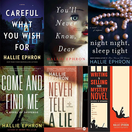
Great cover! And it feels like your ‘brand’ As well - I care a lot about my book covers - people always cComment on the creepy doll on my current cover. It gets noticed! Which is of course the bottom line
ReplyDeleteCreepy dolls should always get noticed, Hallie! And then the running away starts... but with your book tucked under one arm. :)
DeleteThank you!
Mark P.
This cover is stunningly beautiful! I am a big fan of book covers and have definitely bought books judged on the cover. Of course, I do read what the book is about first. It doesn't take a psychic to predict that a large number of readers are going to be attracted to The Book Artist. I am woefully behind in the Hugo Marston series, which makes no sense since I loved the first two books. I need to catch up pronto.
ReplyDeleteThank you, Kathy, I'm thrilled you like it! Of course, I agree that you need to get caught up with Hugo... but no hurry, I know how many books are out there deserving of attention so I (and Hugo) can wait for you. :)
DeleteMark
Thanks you, everyone for you lovely comments, I apologize for not responding sooner but I'm traveling and am only now able to sit in front of a computer!
ReplyDeleteA big thanks to Debs and my other friends at JRW for indulging me with the cover reveal, I'm thrilled with the responses. Love to you all!
Mark P
PS It's commenting as DA Confidential, my true-crime blog, but it's really me!
I love the new cover! So pretty!
ReplyDelete