 |
| Available NOW! |
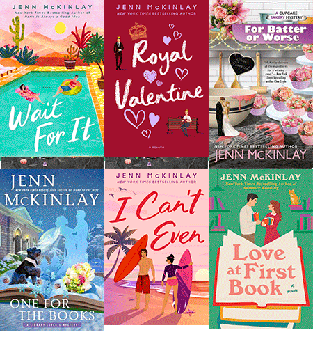
After forty-five books, I've been through the "birthing" of many many book covers. Thankfully, I have been blessed by the cover Gods and all of my book covers have been truly dazzling. From my stand alone Paris is Always a Good Idea (artist Vikki Chu):
 |
| July 2020 |
to my Bluff Point and Happily Ever After romances, like About a Dog and The Good Ones (designer Katie Anderson):
through the cupcake bakery mysteries, kicking off with Sprinkle with Murder (artist Jeff Fitz-Maurice) and the hat shop mysteries, starting with Cloche and Dagger (artist Robert Gantt Steele), I have been one happy author.
But this cover. This cover blew me away. The concept for the Library Lover's mysteries began with two things, an open book and a view of the library in some way. Here they are:
After ten books, I was quite sure our brilliant artist, Julia Green, could not possibly come up with a way to showcase the vision I had requested. You see, I had just been to Paris and bought a pop up children's book of Beauty and the Beast because I always buy children's books in countries when I travel. No idea why. I just do.
When I landed back in the States, the first email was "How do you see the cover of One for the Books?" Of course, I replied, "Can it be a pop up book?" They were dubious but said it would be discussed. I forgot about it and then weeks later, I opened my email to see this:
Did I approve, they asked. Um...HECK, YEAH!!! When the color version arrived, I about keeled over. To say the artist had far exceeded my expectations, would be a gross understatement. Truly, and appropriately, it was love at first sight.
So, Reds and Readers, what book covers have you fallen in love with at first sight? And that age old question, how much does a cover matter?
ONE FOR THE BOOKS:
Wedding bells are ringing in the latest page-turning Library Lover's Mystery from the New York Times bestselling author of Word to the Wise.
Love is in the air in Briar Creek as library director Lindsey Norris and boat captain Mike (Sully) Sullivan are finally tying the knot. The entire town is excited for the happy day, and Lindsey and Sully's plan for a small wedding evaporates as more and more people insist upon attending the event of the year.
When Lindsey and her crafternoon pals head out to Bell Island to see if it can accommodate the ever-expanding guest list, they are horrified to discover a body washed up on the rocky shore. Even worse, Lindsey recognizes the man as the justice of the peace who was supposed to officiate her wedding ceremony. When it becomes clear he was murdered, Lindsey can't help but wonder if it had to do with the wedding. Now she has to book it to solve the mystery before it ends her happily ever after before it's even begun….
Also, I'll be appearing on Good Morning Arizona tomorrow 9/2 with anchor Olivia Fierro at 8:40 AM PST, let's all hope for no wardrobe malfunctions or poppy seeds in the teeth moments!



Happy Book Birthday, Jenn . . . I can’t wait for my copy of “One For the Books” to show up in my mailbox. [And I adore the cover!]
ReplyDeleteCovers I have loved? Aside from the Jungle Red ladies [who always seem to have amazing covers], I’m a bit partial to the covers for “The Little Prince” and Christopher Paolini’s “To Sleep in a Sea of Stars” . . . . .
Those covers really do engage the imagination, Joan. I can picture The Little Prince in my mind the second it's mentioned.
DeleteCongratulations and Happy Book Birthday, Jenn! I am crazy about this cover for your new book. You just know with a cover like that the story inside is going to be enchanting. All of your books have irresistible covers.
ReplyDeleteI always look forward to covers of the Jungle Red authors. They are tempting invitations to see what’s inside, and the stories certainly live up to the covers.
I’m going to have to give some thought to covers outside the Reds. I have bought some books because of their covers. Even though I had all my he Sue Grafton books, I bought an early one (I think it was G) because it had Kinsey’s yellow VW on the cover.
A yellow VW will draw a reader in, for sure! LOL.
DeleteThat is a great cover.
ReplyDeleteHow much do covers matter? If I don't know the author, then an eye catching cover certainly does draw me to the book. But, as they say, you can't judge a book by the cover, and some times a book with a so so cover has proved to be a book I've loved.
In a twist of irony, I'm starting book 8 in this series today. I'm hoping I'll be up to date by the time next year's release comes out.
I'm just trying to keep you occupied, Mark ;) I know what you mean, about so so covers. I found Janet Evanovich's first book in paperback in '98 and it was a fairly plain cover but the humorous story telling reeled me in, as it does.
DeleteHappy book birthday, Jenn! Cool cover! I am drawn to historical fiction covers that are stylized illustrations. Catriona McPherson’s Dandy Gilver books are a good example. Clara McKenna’s Stella & Lyndy books are another. Dianne Freeman’s are more cartoonish but interesting. And Evie Dunmore’s latest is laugh out loud funny: a war of the sexes with the female pouring a teapot on the male’s boots.
ReplyDeleteI was lucky enough to get an advance copy of Evie's book - the engaging cover matches the tone of her books so well. It's such a smart series, I adore it!
DeleteHappy book birthday, Jenn! Amazon assures me that my copy will arrive today. I can't wait! The Library Lovers series is such fun.
ReplyDeleteI love a good book cover, and I really dislike certain elements about a bad cover--headless women being my all-time least favorite element. Anyone who browses the romance aisles has seem those covers. The artwork is probably stock, and only shows the woman from the neck down, as if her torso is the only part we should care about.
On August 26, the Washington Post ran an article about current book cover trends, citing "busy botanicals" and "women walking away," as current faves. These both strike me as stock art that the publisher's art director can buy to put on any book that fits. Jenn, you're really lucky to be able to work with your cover artist and at least get a measure of approval for the finished product.
I've been fascinated to sit on the sidelines as my sister--an artist herself, and the last word in covers for our indie press releases--worked with the cover artist to create covers for my two e-book novelettes. She will drill down to the level of how the protagonist's hair is styled, and what the hero's lips look like. I love my cover for Deep Ellum Pawn, and I think the cover for the upcoming Deep Ellum Blues will be just as cool.
Here's hoping it's happily ever after for "One For the Books"!
I will go remind myself of your cover Gigi. The most amazing thing is that Jenn said "can it be a pop-up book?" and the artist came through so completely with this vision!
DeleteI think it's fabulous when an author can share her vision with the editor and cover artist. And a pop-up book? I would never have thought of that. It's a great cover. How much cover input do you have? Warren had zero.
DeleteI have been very lucky. All of my artists have been amazing responsive to my requests and then they blow me away by taking a suggestion and making magic happen.
DeleteSo many congratulations, and for landing the TV show, too! That cover is definitely one for the books. So lovely. You know you've made it when your name on the cover is bigger than the title. ;^)
ReplyDeleteMy first and third mysteries were originally written under the name Tace Baker and pubbed in 2012 and 2014 by a micro-press. I always hated the covers - they used stupid stock art of a woman who was nothing like the protag, they got the season wrong, and so much more. Beyond the Page re-released the books this summer with fresh edits and new covers under my name, and the covers are stunning. Atmospheric, beachy, dark, and beautiful. I am thrilled with them (you can see them here: https://edithmaxwell.com/books/lauren-rousseau-mysteries/).
As for stunning covers, I Was Assigned the Single Bird by Lucy's sister Susan Cerulean just blew me away!
DeleteThat's wonderful, Edith. I've heard so many stories from authors whose first covers were not on point. Getting a do over is such a gift. I Lucy's sister's cover, too. Stunning, plus my dad was a bird guy so it reminds me of him. Very poignant.
DeleteEdith, I've seen your updated covers and they are really stunning. And I agree with you about I Was Assigned the Single Bird. Gorgeous.
DeleteHappy book birthday, Jenn. The cover is gorgeous.
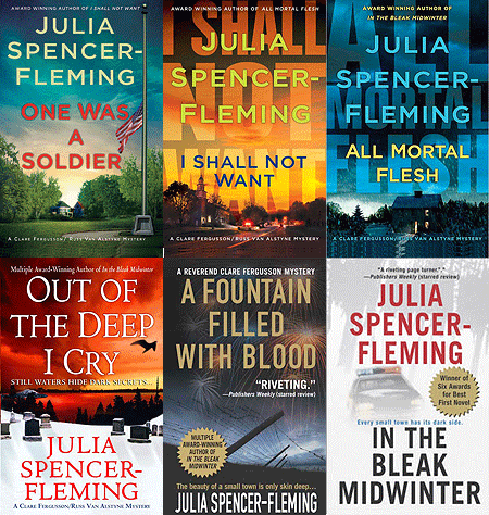
ReplyDeleteI'm with Joan on The Little Prince. I confess that I bought Julia's All Mortal Flesh on a 98 degree day in South Florida because of the cover. It was a happy purchase and sent me on a quest to read all of her books.
Finding a series is the BEST!
DeleteI've had the experience of reading a good book with a horrible cover--like Edith noted--just everything about the cover misrepresented the story inside. So I love it when the covers are interesting, enticing the reader to pick them up and browse the contents. Jenn, this cover is so clever--and unexpected--even if I wasn't familiar with the series, I'd have to check this book out!
ReplyDeleteThis is off-topic, but given the climate of negativity swirling about us lo these many months, I'd like to recommend a book I couldn't put down. It's nonfiction--Humankind, A Hopeful History, by Rutger Berman, translated from the Dutch by Elizabeth Manton and Erica Moore, published by Little, Brown and Company (Eng. trans. 2020). Well-written, thought-provoking, and, well, hopeful.
Oh, thank you, Flora. 2020 has been a struggle in darkness for me and I could use a positive book.
DeleteThank you, Flora. Looking up now!
DeleteCongratulations, Jenn! I love that cover and I'm one that doesn't usually even care about a cover. I'm sure your book will live up to the cover and more!
ReplyDeleteI love to buy children's books too. My grandchildren are too old now for the kinds of books I like to buy so I admit it - I'm buying them for me!
Same. My foreign books are all for me :)
DeleteWhat a beautiful cover, Jenn! I love a cover that entices me to pick up the book - although others have said, a good cover can hold a so-so story and vice versa.
ReplyDeleteVery true, Liz! You just never know until you read that first chapter.
DeleteWhat a charming idea, to use a pop-up book for this latest Library Mystery. I love how it turned out, too. Happy book birthday, Jenn! And may I say, 45 books!! Wow. That's an impressive output, my friend.
ReplyDeleteCovers matter a lot less when reading e-books or listening to audio versions. Even if the cover is visible, it's so tiny as to mean virtually nothing, insofar as communicating what is inside the book itself. However, a good cover can tell you a lot about the story.
Back in the day, covers had titles, the author's name, and the publishing imprint, and not a lot else. I have hundreds of books like that, without any colorful dust jackets. (I used to throw them away as soon as I bought the book.) Now, especially certain genres, physical books have covers that telegraph the genre as surely as if it were on a specific shelf in a bookstore, even in a tiny icon form. Very colorful covers like the ones above promise a much different tale than those with dark, brooding covers. Visual shorthand.
I have a different experience than you, Karen. I am usually choosing my audiobooks from a digital library that has rows of book cover thumbnails with just the title and author name beneath, so covers do mean something to my selection process. I appreciate it when the cover communicates something about the genre. Generally, I feel like I should get a different sense from the cover of a cozy mystery than the cover of a thriller or the cover of historical fiction. And I usually do. It's those wonderful genre-defying books that sometimes get short shrift on covers, in my experience.
DeleteYes, it's becoming all about the thumbnail these days. There was much debate about the colors for the Paris book red/cobalt blue v. pink/aqua. I chose the pink/aqua but it was a tough call!
DeleteI think you made the right choice, Jenn. The cover is so eye-catching!
DeleteLove the pop-up cover! With the exception of the many intricate details on cozy covers, most fiction covers feature windows, doors, empty roads, contrasting light and dark, the author's name in big print. They do the job without being memorable.
ReplyDeleteAgreed. I like a memorable cover :)
Delete45 books--oh my! Remarkable. Congratulations on the newest! And your covers are gorgeous. Hope you enjoy celebrating your newest book release day!
ReplyDeleteThank you, Jess. Much appreciated. XO
DeleteHappy Book Birthday! I'm still not quite up to this point in this series, but I will be soon.
ReplyDeleteI admit that the cover isn't usually a big consideration for me -- I'm a lot more apt to choose a book based on the author or a review I've read. But I believe I did read Magic for Liars by Sarah Gailey just because the cover kept catching my eye. I also think Ellery Adams' Secret, Book & Scone Society series has especially strong cover artwork.
I'll have to check those out. Also, the title Magic for Liars is AWESOME!
DeleteI looked up the Ellery Adams covers--fabulous!
DeleteCongratulations for One For The Books , love the cover.
ReplyDeleteI like when a cover really reflects what is in the book, too often it doesn't.
Most of my American books are E-books and from authors that I already know but when I go to the public library, a cover can catch my eye and I look what it is about.
What is interesting is the differences in covers when a book is translated and sold in different countries.
Danielle: I agree with you about how interesting it is to see the different covers -- and titles -- the same book has in different languages and countries. The story is translated and so is the title and the cover art.
DeleteSometimes i love my foreign covers even more...shh, don't tell.
DeleteOh yes, covers are such a big deal to me! And a gorgeous one is such a treat. Jenn, this is fabulous! Lovely and magical. speaking of trends, have you noticed the bird? Once you start noticing it, it’s everywhere! A big crow, smack dab in the middle of the cover. Have you seen it?
ReplyDeleteThank you, Hank and, oh dear, now I'm on a quest...
DeleteCongratulations, Jenn, on yet another book birthday. Wow! And what a beautiful cover.
ReplyDeleteYes, covers matter, though mostly with new-to-me authors. That said, I am no longer browsing in bookstores, but looking up books online before ordering them from my local independent through their website. While the cover is always interesting, it's actually the synopsis that makes the difference for me these days.
That's so true. And, if it's a new to me author, a recommendation by a reader whose tastes line up with mine, makes a huge difference. That's how I've found Vivien Chien, Jodi Taylor, and Abby Jiminenz.
DeleteThose authors are new to me, so I'm off to 'meet' them now...thanks, Jenn.
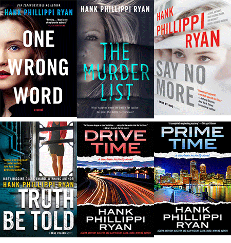
DeleteAnd I agree, Gigi, about the body parts. The cut off head, only showing the torso, often her back. Why is that? Also, have you noticed that if there is a woman on the cover, how seldom she is looking right at you? There’s always the averted gaze, the over the shoulder wistfulness, the downcast eyes. That’s one reason I love the cover for THE MURDER LIST— She is very confrontational, and that’s so powerful. .
ReplyDeleteI agree that the woman on the cover of The Murder List is very strong. I think artists cut off the heroine's head because they are selling a stock cover, to be used by any book the publisher wants to use it on. If the heroine has no head, the artist doesn't have to go back and make blonde hair dark, or strong features delicate, or deal with any other descriptors the author uses. Ditto the back view. If she's walking away, an artist doesn't have to make crucial decisions on breast size. It's just easier. What about men on covers? I'll confess, I've never done a comparison.
DeleteUgh, the headless heroine/hero. Not a fan. I always thought they did so that the reader could put their own take on the character but what Gigi says about not having to tinker with specifics makes more sense.
DeleteJenn, HAPPY BOOK BIRTHDAY! I just posted it in my IG stories. I LOVE all of your book covers. You really lucked out with your book cover artists. When my book is published, I hope that your book cover artist can do my book cover art too. Your Library series always has that really cute dog on the cover. The dog reminds me of the Greyfriars dog.
ReplyDeleteI preordered your book.
Diana
I saw your story!!! Thank you so much, Diana! I hope you get an amazing artist, too!
DeleteCongratulations on your book birthday, Jenn! I love the cover art and agree that the "cover gods" have been very kind to you. I own most of you books on Kindle. I bought the Kindle at the beginning of the pandemic because the library wasn't open. I'd made a New Year's resolution to read Reds! I read the first Hat Shop mystery on my new Kindle and it offered me the entire series at a price I couldn't refuse. Two weeks later I bought the first Cupcake Bakery book for my Kindle and then did the same thing. I began the Library series about 2 weeks ago and am finishing up book 5. My library has them but it takes a few days, so now they are also appearing on my Kindle, too. I'm pretty sure, although I'd love to hold that gorgeous book, that I'll just put it on the kindle and have it the day I want it! Truth be told, I buy books for the authors, not the covers.
ReplyDeleteThe cover art for most of the Jungle Reds' books is wonderful. Deb's latest cover was WOW as was Hank's. I think that the Royal Spyness covers are absolutely fabulous. The other series that has consistent and stunning cover art is James Benn's Billy Boyle WWII mysteries. His newest book, The Red Horse, came out today, too. But story trumps cover any day for me.
Thank you so much, Judy! Much appreciated! And, yes, the story is the most important part - absolutely!
DeleteUnless it's a new release of a popular author so there is a pile of books in the bookstore with the cover on display, most my book browsing has been done spine first. Laura Child's Tea Shop series had some nice covers. I like the earlier ones that seemed to have a frame around the cover art. I'm looking forward to reading your new book Jenn, that arrived in my Kindle last evening before I went to bed.
ReplyDeleteThanks so much, Deanna. Laura Child does have fabulous covers. I always want to walk into them.
DeleteCongratulations, Jenn! And congrats to all the happy readers who have been waiting for the next book in the Library Lovers mystery series.
ReplyDeleteYou are indeed blessed by the cover gods. Which in itself isn't unusual - lots of us have great covers. But what I find unique is how all of your book covers somehow also reflect you, Jenn McKinlay: funny, cupcake-eating, book-reading, dog-loving librarian. You may be the only author I know of whom I can say this - want to know what Jenn is like? Look at her book covers.
What a great observation, Julia. So true.
DeleteLOL!!! That's hilarious and totally true.
DeleteHappy pub day, Jenn!! I'm waiting on my copy to arrive! It is truly a fabulous cover, and I know this is a special book for you.
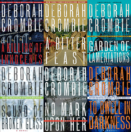
ReplyDeleteThe covers I am usually drawn to (if the authors are unfamiliar) are usually quirky, often stylized historical, sometimes just gorgeous art, or anything with a map! I've had some very odd ones, including one with a stock cover that made it look like a Victorian historical (!) and I later saw used on a couple of other authors' historical novels. That said, my current publisher, Morrow, has done fabulous covers, including the books using my own photos, and the latest, A Bitter Feast, which I think is gorgeous.
I am seldom tempted by thriller covers, especially those with headless women!!!!
Maps!!! Yes! It's a thing. I love a good map. I think that's how the boys and I found Here There Be Dragons (so good!).
DeleteHappy Happy Book Birthday, Dear One!
ReplyDeleteThe cover is, indeed, smashing!
And I totally agree with with Julia said. Your covers are perfect reflections of who you are.
xxoo
Kaye
Thank you, my dear. I would say the same about your book covers - charming, engaging, and 100% you :)
DeleteHappy book birthday, Jenn! That cover is amazing. It really looks magical.
ReplyDeleteThank you, Jennifer! I'm a little in love with it!
Delete