LUCY BURDETTE: Since next summer’s Key West mystery is number 14 in the series, I knew exactly what to expect along the way. A year and several months before the publication date, I knew I would get an email from the publisher asking for a book summary, cover ideas, and title suggestions. I try to think ahead, even though the book isn’t written yet and there isn’t even a ghost of an outline. Here’s what I sent in:
Key West food critic Hayley Snow is working on this week’s articles for Key Zest magazine when an intriguing e-mail hits her inbox, titled Hemingway’s toxic love and an old story. Catherine Davitt tells Hayley that she has returned to the Keys to research a book, but she also wants to investigate the disappearance of an old friend back in the late 1970s. The two young women were part of a group of lost souls camping in the mangroves on Big Pine Key, until Catherine’s friend Veronica disappeared, and the Sheriff’s Office cleaned out the camp.
Ever-curious Hayley agrees to help her, and they travel up the islands to Big Pine Key to talk to some other Islanders who were around in the 70s. After chatting with one woman who has nothing much to add, they stop at an old motel to visit a man who was on the outer edges of this commune. Instead of answers, they find him murdered. It’s hard not to imagine a connection. Then Catherine disappears, leaving Hayley and Miss Gloria to unravel two possible murders, one old and one new, and track down a murderer who might very well have them in his or her sights.
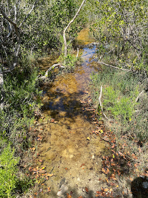
As for the cover, I told them I’d love this one to look a little bit vintage, with perhaps a weathered picnic table with a Key deer nosing around in addition to the requisite cat. (There are two storylines woven together, one from the 70’s and the other today.) If we chose a vintage postcard look, I said, the title and artwork could be cached inside the words—see the Key West postcard. These are the photos I sent:
Way, way, way far down on the page, I added, 'if the vintage postcard idea isn’t chosen, another option could focus on this picnic table, with umbrella and deer and cat, but a more scruffy background as Big Pine isn’t manicured like Key West.' (I really had my fingers crossed for the vintage postcard look.)
 |
| John has a cameo:) |
And here was the first draft I received:
Well, sigh. No deer, no vintage postcard. Though there is a turtle! (Though there is no turtle in the book...) I went to bat for a few changes, and I've come to realize that the vintage look would have distracted from the series look. It's gorgeous, don't you think?
Question for readers: How important are the details of a book's cover when choosing what to read? Do you notice changes within a series?
If you'd like to read my other cover drama stories, you can find them here:




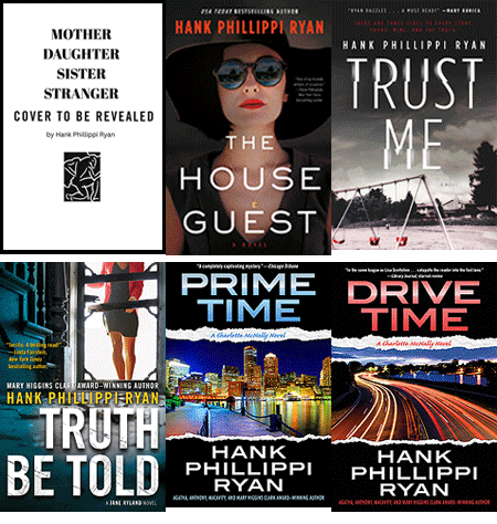
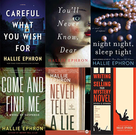
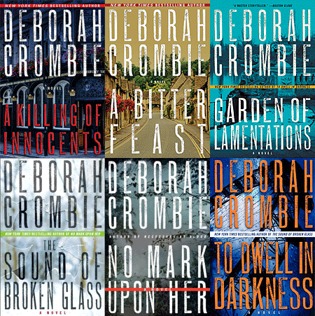
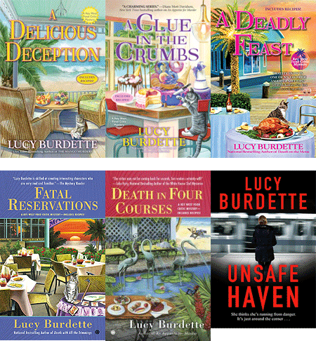
Lucy, I love this cover! [And perhaps I am the only person wondering this, but why the "requisite" cat?]
ReplyDeleteI'll admit that I like looking at book cover illustrations and sometimes the interesting art captures my attention, but more often than not it is the author's name rather than the cover that captures my attention . . . .
Thanks Joan! I can't remember why Evinrude the tiger cat appeared on the first book, but now he's here every time. I think marketing believes cats=cozies:)
DeleteIt may not have been everything you wanted, but it is a gorgeous cover. Congrats!
ReplyDeleteExactly, thanks!
DeleteWhat Mark said! Odd that they didn't want to use the deer, though.
ReplyDeleteI also have a requisite cat on one of my series' covers, who really gets around.
Ha ha, yes, there's no way the cat would have made his way up the keys to Big Pine!
DeleteI liked the old postcard idea too but I do like the cover they came up with. The turtle is a nice touch. Looking forward to reading this book when it comes out. I've read all of the Haley Snow/Key West mysteries and in order. Love the idea of living on a houseboat and Miss Gloria is a total hoot. I've been to Key West twice and can picture a lot of the places you mention in the books. I want to go back and my husband has never been. I think he would enjoy it. We could take the ferry from Ft. Myers.
ReplyDeletethanks for all that reading Paula! Miss Gloria has gotten very popular. I hope you bring your hub!
DeleteIt's a beautiful cover, Lucy! Having a love/hate relationship with a number of my own covers, I no longer hold any expectations for others' covers to accurately portray the story inside. I think the mood of the cover is more important than the images themselves.
ReplyDeleteThat's very wise Annette. And the mood is so important. If they capture the gist of your story, you are a lucky author.
DeleteThat is a beautiful cover, even if it's not exactly what had pictured originally, Lucy. The book cover catches my attention and draws me in, but it's only after I've read the book that I will study the cover to see how its details show clues to the story.
ReplyDeleteAmanda, I don't think I've ever thought to go back and study a cover for clues. Now it's in my mind!
DeleteEven though it is not in the book, I would have the cat playing with a human skull instead of a turtle. I'm evil that way.
ReplyDeletethat would have been a very good idea!
DeleteI love this cover! Love it! I agree with Annette that it is more important to convey the mood than to accurately convey aspects of the story. Otherwise, Eninrude would be back on the houseboat.
ReplyDeleteWhile a cover might entice me to pick a book up and read the synopsis, the author and the genre will have more to do with whether I read it or not.
Hayley Snow has become an old friend at this point, and this storyline is brilliant. I'll pre-order as soon as I can and maybe pick it up at R.J. Julia next summer.
You're such a pal Judy! Next August I hope to share the spotlight with Sarah Stewart Taylor at RJ's so you won't want to miss!
DeleteI agree Judy, Haley Snow and Miss Gloria and the other characters are like old friends that we get to reconnect with, with each new book.
DeleteThe cover is very attractive and an improvement over the first go. I am not a huge fan of cats so that is not a draw for me and there are some cozy series I just won’t read because cats are featured prominently in the stories, especially not magic cats. In this one I just see the cat as cute and curious about the turtle. Am I expecting them to be in the story? Not sure. I probably would not have studied each element of the cover so intently had I not been reading about it here.
ReplyDeleteLOL Brenda on the magic cats! The Key West cats are just part of the whole cast of characters...
DeleteYes, I’ve read some of the Key West books. I like Hayley and Miss Gloria.
DeleteIt's beautiful, if not what you pictured. An intriguing cover will get me to pick up the book, but not necessarily buy it. I do think the cover mood should match the tone of the book.
ReplyDeleteI've been relatively lucky with my covers.
Yes your covers have been excellent!
DeleteI've read and love all the Haley Snow books in the series. Yes the cover can influence what I buy but it is not the only factor. I love the cover - it is super one of the better!
ReplyDeleteHowever, I have one question: Why Poisonous Palate. Is there a poisoning? If so the title might give the story conclusion away.
It was one of the suggestions I sent into the publisher and that's what they preferred. I don't think it will give anything away. The poisonous palate in this case is more emotional than anything else!
DeleteEither way the title would catch my attention! And I automatically call my local bookstore and pre-order your books as soon as I can. It is always hard waiting! :) But definitely worth it.
Deletethanks so much for pre-ordering, and at a local bookstore, yay!
DeleteThe cover is lovely, though I did like your ideas! I really like the sunset under the umbrella. The perspective draws the eye. I choose based on the author/series and tend to notice cover art only in passing. If I'm looking for something new, the title will draw me more than the art.
ReplyDeleteInteresting about the title pulling you in. That's always a drama-filled discussion as well:)
DeleteLucy, the cover does fit well with your series 'look', conveys the mood, and the turtle is a bonus. However, I think there was room to have a Key West deer's face just peering out of the vegetation on the left beyond the fence :-). And I have gone back to look a cover over after I've finished a book.
ReplyDeleteI know, still sad about the deer.
DeleteArtists and writers think so differently, don't they? What a process you have to go through!
ReplyDeleteSomething is bugging me about this picnic table. It takes up the entire beach access, almost as if it's deliberate. Otherwise it's a pretty picture, but the placement doesn't make any sense. Does that bother anyone else?
Artists and writers and MARKETERS think differently LOL!
DeleteKaren I didn't think that at first but now that you mention it....it is an odd placement. LOL.
DeleteThat said, covers do little to influence me, especially if they are attached to a series I'm already committed to.
DeleteLucy, you are currently my read-in-bed book. It is an ebook and A Scone of Contention. I admit that I never really look at covers except when I am zipping through ‘what is new’ and sometimes think that that author’s covers are so close to that other author’s cover that they must go to the same graphic artist company! The author is usually the reason I get a book when I am reading a known to me author, or recommended to me, so once again the cover is of no importance. I can see how the cover(s) would make a difference in a display in a bookstore.
ReplyDeleteI just out of curiosity went to the virtual library and looked at your covers. First thought is that I would be more drawn to the later covers than the first ones – a wise decision on your part.
In accolades, I love how you have created all your characters to make them memorable in my mind, and make me want to pop in to supper with Haley’s mother. I wonder how Connie and Ray and baby can live on a houseboat – where do they put all that necessary stuff!
In other accolades, I just finished “Murder on Cape Cod’ and laughed when it was thought that Louise Penny was walking down the street. Well done cameo!
thanks Margo, love hearing that you want to have dinner with Hayley's mother--me too!
DeleteLucy, I've noticed that all the book covers in the series have a table set with food. I love the covers btw. I noticed one or two seemed (A Scone of Contention and A Dish to Die For) different art wise. Have all the covers been done by the same artist or are they usually done by different people?
ReplyDeleteI think the most current one you showed us above is perfect. It says - I'd like to be sitting there having dinner with friends watching the sunset in the Keys in Florida. I don't think a historical postcard look would be the right fit. The story is really more about today's characters looking back to a past murder.
They were all done by the same 2 artists. So glad you like this one!
DeleteI really like all the covers. The artist include things that are in the story which I like as well as nice designs. So its a win-win.
Delete^ as opposed to a story set in the past. I left that last part out from above.
ReplyDeleteLUCY: I like the cover even though the suggested deer is missing, and of course because there's food!!
ReplyDeleteYou're lucky that your publisher asks for ideas for your book covers. I know many authors have zero input in the design process.
I'm looking forward to reading about Hayley's new adventure in Big Pine Key!
Thanks Grace! I know I'm lucky that they ask and lucky to have had these artists all the way along.
DeleteThe cover is beautiful and I think that's what counts. You got a turtle; I got a large picture of a pelican on my last cover that has nothing to do with the storyline.
ReplyDeleteI remember that pelican LOL!!
DeleteI agree with Karen about blocking the beach access. How do we get past with umbrella, and all my stuff? And it doesn’t look like Big Pine Key which is really wild, isn’t it? It’s eye catching and it’s good to have the brand look.
ReplyDeleteI think covers are very important. They are what makes someone pick up the book. We haggle over mine for ages!
Interesting the diverse views on book covers. I do not look at them at all.
DeleteNo it doesn't look a whole lot like Big Pine:). I love hearing about the process of yours Rhys
DeleteGorgeous cover, Lucy. Perhaps the cover is supposed to convey the mood of your story?
ReplyDeleteFor me, it helps me if I can read the book title on the cover to remind me when I write book reviews. Sometimes, in other books, the background color is too close to the color of the letters in the title and it is hard to read.
My decision to read a book has more to do with Reading the synopsis of what the story is about, unless I already know the author and any book by that author is an auto-buy for me. Since I already am familiar with your Key West novels, I automatically request your books from the library whenever I get the chance to. And in the book room at mystery conferences, it is easier for me to find your books because I can read the title.
And I love the title! Perfect!
Diana
thanks Diana! it is hard to keep a long series straight...
DeleteI love hearing how your ideas transform to the cover which I love. I'm a visual person, so I always look at the cover first.
ReplyDeleteThanks Dru, I did not know that about you!
DeleteThis is great—and very Lucy Burdette! It doesn’t really have to make sense, it’s just a collage, really, and a beautiful one of that.
ReplyDeleteAnd I love your vintage postcard idea, and though it would be off track for the Key West books, maybe for your next series? :-)
Yes they were right to ignore me:). I'll save that idea for another time.
DeleteWhile the cover art attracts me, I’m more inclined to buy something in a series by an author, I know and love. That being said, for a for a cover of a book that takes place on Big Pine Key, there should really be a key deer. After all they are so adorable.
ReplyDeleteI know, sigh...
DeleteI like the postcard ideas, especially the twin trees but they horizontal which might cause printing issues. Book printed with flip up pages? :-) (sorry, I need a little chuckle this morning) I like the final cover but miss the deer.
ReplyDeleteIf the cover is too busy and distracts from the title and author I may pass it up if the author is new to me.
Interesting about a cover that's too busy...and the book flip chart!
DeleteIt's a beautiful cover, and I think you're right that the vintage postcard look would separate it from the other books in the series. Although they could have tucked a vintage postcard in amongst the food on the table . . . It looks great, and I'll bet it's super-tasty, too.
ReplyDeletethe vintage postcard would have been so clever Gigi!
DeleteI think your new cover is very appealing, Lucy--it draws me in (especially the flowers). I don't think I pay attention to the details on a book's cover; in this case, I didn't notice that the table was blocking the path nor wonder if there was a turtle in the story. The sense that a cover is pleasing and well-designed: I think that's important, and this cover gives me that sense.
ReplyDeletephew, good news from you!
Deletei agree and I thought the cat being what appears to be curious about the turtle is cute. Aren't turtles popular in that part of the Keys? Not sure personally.
DeleteMuch as I love the postcard idea, the cover is beautiful, and very evocative of the Keys in general.
ReplyDeleteBecause I read on Kindle, covers are not as important as they were when I read in paper - I still love looking at them as I start a new book, though, and I do look for cover elements in reading the story.
The kindle really changes things, doesn't it? I still can't really warm up to ebooks.
DeleteLucy, I love your vintage postcard idea, but I can see why they didn't go for it - this cover really goes with the other in your series, and above all, publishers want consistency!
ReplyDeleteI think if you ever get a rebranding - say, if they issue you trade - you should 100% go for a vintage post card theme - I think it would be very appealing to readers.
Yes, if they were all vintage postcards, how cool!
DeleteLike Kait, I read mainly on my Kindle so the cover isn’t what I see. And when I think about perusing the mystery section in a book store, most of the books are shelved spine out so the cover isn’t the first thing you would see. Having said all of that, an interesting and/or appealing cover is always a plus and your cover is both (though I am now with Rhys and the others about the table blocking the beach access). With the Reds, I read your books because I am seeking out the authors, not the covers. Obviously the marketing department is trying to reach a larger audience than our blog “family”! — Pat S
ReplyDeleteCan you imagine that there are people more important than the Red family??
DeleteLove the vintage postcard idea, Lucy, but "the brand" is super important, and I think your readers would have been confused. Your covers--including this one--are brillant. They POP, and are instantly recognizable as "Lucy Burdette, Key West mystery." I think marketing and the art department made the right call. And I can't wait to read it!
ReplyDeletethanks Debs, I agree with you
DeleteI love the final cover! I also love the vintage postcard idea but it probably should ahve started with book one and then continued - author branding and all that. I can't wait to read this one, Lucy. So...did you work in a turtle?
ReplyDeleteDarn it, there is not a turtle to be found.
DeleteLove the cover Lucy and it does "match" with the other books in the series, so that is probably for the best. However, nice as it is, the cover is not what gets me to look at the book. If you have written it I already know I want to read it! Then after I have finished reading the book is when I look more closely at the cover art to find things from the story. Your blurb about the book is great. I can't wait to read it.
ReplyDeletethanks so much Judi!
DeleteAnd still it's a gorgeous cover... and I agree, it's "on brand."
ReplyDeleteI love the card NO-NAME KEY... now that could be a book, dontcha think? A little bit of an island beween the named keys on which someone gets washed up and something... happens.
Yes in fact one of my writer pals down here has written that book:)
DeleteI may be odd wo/man out here, but I prefer the muted colors of version one. Hints at things past. Elisabeth
ReplyDeleteIf I'm not famliar with a series, the cover will catch my eye. If I am already a fan, I like covers but read the series even if i don't like a particular cover. I like the changes you made. aprilbluetx at yahoo dot com
ReplyDeletethanks April
DeleteThe cover is colorful and eye catching, but looks quite civilized. We need some scruffiness there for Big Pine!
ReplyDeleteI know, more scruffiness would have been realistic!
DeleteThe cover is beautiful! Covers can entice me to read the back synopsis if I'm not familiar with the title or author, that's not the case here! I love the bright colors. A key deer peeking through the saw grass would've been cool too. Evinrude could be traveling with Hayley and Miss Gloria to Big Pine Key.
ReplyDeletewe all agree on the deer:)
DeleteI love the series and the covers. I realize this one is on Big Pine, so a deer would be great. In Key West I’d add a chicken.
ReplyDeleteOh, a chicken would be a great idea!
DeleteI love your books and I love the Florida Keys. We used to rent a house in Marathon for 15+ years from 2003 to about 2017 and stayed two months. I loved the old postcards that you included. No Name Lodge still looks the same though that sign is gone. No Name Pub in the cameo photo makes me homesick to go back. I have photos of that place from the same viewpoint as yours. Did you know that the ceiling has over $100,000 dollars stapled to it? I like the cover as it is the same style as your other books of which I have read all of them. I like books on the Keys, and I also like cats and dogs in the books though I only have a dog. I only use my Kindle on trips as I still like books in my hands (old friends). I choose a book, first by authors, I know and love, second by the cover and third by the synopsis. I do not like covers that look animated and I do like them to have some element of what the book is about. I agree that it needed a Key deer peeking out of the sea grass and that the table blocks access to the beach, but it works. What most people don't realize about the Keys is that they don't have beaches that look like that hardly at all since they are all built on coral. Most of the ones that look like that are manmade and usually at resorts and there probably isn't any sea grass lining a long access as there usually aren't any accesses like that. Most everyone thinks the Keys are full of beaches, so you have to work with that idea. Can't wait to read it.
DeleteI do think the cover should represent something in the book and when there are details there that aren't it does distract me! I had that issue with a book I just finished. There cover clearly showed a dog on the cover while in the book there were cats, horses but no dogs.
ReplyDeleteGorgeous! <3 S. Mary
ReplyDelete